This article explains the AppBar widget in Flutter, highlighting its properties and showing an example of how to customize it.
The AppBar is a rectangular area at the top of the screen that displays the app’s title, actions, and other content related to the current view. In Flutter, the AppBar is used within a Scaffold widget to create a standard app layout.
Key Properties of the AppBar Widget
The AppBar widget offers various properties that can be customized to suit different app designs:
{
Key? key,
Widget? leading,
bool automaticallyImplyLeading = true,
Widget? title,
List? actions,
Widget? flexibleSpace,
PreferredSizeWidget? bottom,
double? elevation,
double? scrolledUnderElevation,
bool Function(ScrollNotification) notificationPredicate = defaultScrollNotificationPredicate,
Color? shadowColor,
Color? surfaceTintColor,
ShapeBorder? shape,
Color? backgroundColor,
Color? foregroundColor,
IconThemeData? iconTheme,
IconThemeData? actionsIconTheme,
bool primary = true,
bool? centerTitle,
bool excludeHeaderSemantics = false,
double? titleSpacing,
double toolbarOpacity = 1.0,
double bottomOpacity = 1.0,
double? toolbarHeight,
double? leadingWidth,
TextStyle? toolbarTextStyle,
TextStyle? titleTextStyle,
SystemUiOverlayStyle? systemOverlayStyle,
bool forceMaterialTransparency = false,
Clip? clipBehavior,
}
Each property has a specific role:
- title: Defines the primary content displayed in the AppBar, typically a Text widget.
- centerTitle: Determines if the title should be centered; if set to false, the title is left-aligned by default.
- backgroundColor: Sets the background color of the AppBar.
- elevation: Controls the drop shadow below the AppBar, where setting it to zero removes the shadow.
- titleTextStyle: Allows custom styling of the title text.
Additional properties such as shape (to define a custom shape) and actions (to add action icons) enable further customization.
Full Code:
import 'package:flutter/material.dart';

class AppBarExample extends StatefulWidget {
  const AppBarExample({super.key});

  @override
  State<AppBarExample> createState() => _AppBarExampleState();
}

class _AppBarExampleState extends State<AppBarExample> {
  @override
  Widget build(BuildContext context) {
    return Scaffold(
      appBar: AppBar(
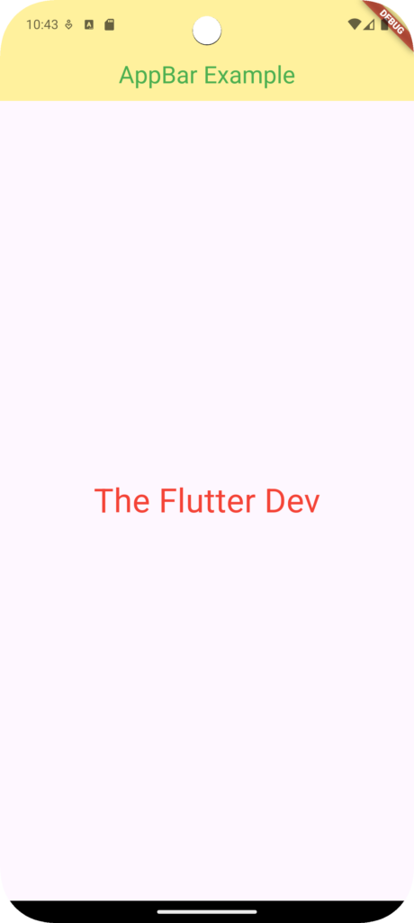
        title: const Text('AppBar Example',),
        backgroundColor: Colors.yellow.withOpacity(0.5),
        elevation: 0,
        centerTitle: true,
        titleTextStyle: const TextStyle(color: Colors.green,fontSize: 26,),
      ),
      body: const Center(
        child: Text('The Flutter Dev',style: TextStyle(color: Colors.red,fontSize: 36),),
      ),
    );
  }
}Code Explaination:
- The title is set to “AppBar Example.”
- centerTitle centers the title.
- elevation is set to zero to remove the shadow.
- backgroundColor applies a semi-transparent yellow color.
- titleTextStyle customizes the title’s color and size.
Output:

Conclusion:
The AppBar widget is essential for building intuitive and customizable headers in Flutter applications. By using various properties, it’s possible to style the AppBar to create a unique look and feel that complements the app’s design. With a little experimentation, developers can tailor the AppBar to fit a wide range of use cases, adding both functionality and style to the app’s interface.